Lesson 16: What Is Normal?
Lesson 16: What is Normal?
Objective:
Students will learn what a Normal distribution is and learn how to identify a Normal distribution.
Materials:
-
Video: New York Times’ “Bunnies, Dragons, and the Normal World” found at: http://www.nytimes.com/video/science/100000002452709/bunnies-dragons-and-the-normal-world.html
Note: Show only the first 41 seconds of the video.
-
Graphics from the Normal Plots file (LMR_2.15_Normal Plots)
-
Projector to display plots
-
3” x 5” cards (1 per student)
Vocabulary:
bell-shaped normal curve normal distribution
Essential Concepts:
Essential Concepts:
The Normal curve, also called the Gaussian distribution and the "bell curve," is a model that describes many real-life distributions and is usually called the Normal Model.
Lesson:
-
Remind students that in Unit 1, Lesson 11 (What Shape Are You In?), they sorted histograms into groups based on their shapes.
-
The Normal Plots file (LMR_2.15) contains some of the unimodal bell-shaped distributions from the original handout of that lesson (Sorting Histograms handout (LMR_1.10)).
Note: You do not need the original handout from Unit 1 – all relevant plots have been compiled in the Normal Plots file (LMR_2.15) for accessibility. Six plots are included: SAT Math, SAT Verb, ACT Mathematics, ACT Reading, ACT English, and ACT Science Reasoning.
-
Display the group of bell-shaped distributions from page 1 of the Normal Plots file (LMR_2.15) to the class and ask the students:
-
What characteristic does this particular group share? All of these plots are unimodal (one mode/peak) and symmetric.
-
Inform students that these types of distributions are often referred to as bell-shaped. Why might this term be used? The histograms look very similar to the shape of a bell.
-
-
To show the similarities between the shape of a bell and the shape of these distributions, a clip-art image (shown here) has been included in the Normal Plots file (LMR_2.15) on page 2.

-
Explain that this shape occurs often in real-life. It occurs so often that it’s been given its own name: the normal curve, or normal distribution. Can the students think of distributions where they have seen Normal curves in previous labs?
-
To give some more background on the normal distribution, play the New York Times video titled “Bunnies, Dragons, and the Normal World” found at: http://www.nytimes.com/video/science/100000002452709/bunnies-dragons-and-the-normal-world.html
Note: Show only the first 41 seconds of the video.
-
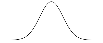
Discuss that the normal curve has a very precise mathematical definition, which is pretty complex. But the result is a curve that looks like the one in the “Bunnies” video. In general, the curve looks like the plot shown below.
Note: You can either draw the diagram below on the board or display it via a projector – the image can be found on page 2 of the Normal Plots file (LMR_2.15).
-
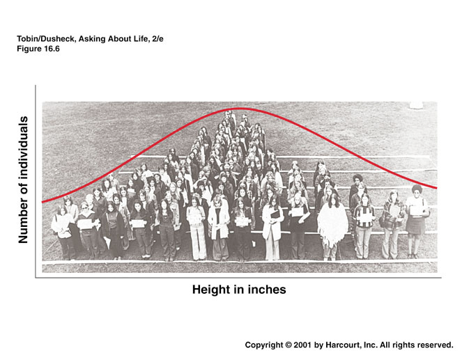
Explain that normal distributions are good for describing some populations of people. For example, people’s heights are often considered to be normally distributed. Display the famous Frank Anscombe photograph (shown below) via a projector. The graphic can be found on page 2 of the Normal Plots file (LMR_2.15). Inform the students that this photo was taken of a group of randomly selected college women who stood in height order.
-
Next, lead a discussion about why the normal curve is a good fit to the histogram in the above picture. Notice that more people are near the center of the distribution, and fewer are in the outer edges, or tails. Engage the class in a conversation using the following probing questions:
-
Notice that there is a peak in the center of the distribution. What height do you think is at the center? The average height of American women is approximately 5’5” (5 feet, 5 inches) tall. We might therefore expect the average height of this group to be close to 5'5" as well.
-
Why are more people in the center, and less people in the edges, or tails, of the distribution? The center represents the mean height. Most women will fall somewhere close to the mean and may be a few inches shorter or taller than it. However, less people are likely to be MUCH shorter or MUCH taller than the mean. For example, we would not expect to see many women who are 4’10” tall nor would we expect to see many women who are 6’0” tall.
-
-
Explain that the normal curve is a good description of a distribution when it makes sense that there is a single 'typical' value with random deviations above and below that value. Ask students:
-
Why does this make sense with heights but not with incomes? With heights, we expect most people to be near the average, with some deviations above and below the mean (people who are taller or shorter than the mean height). However, with incomes, the distribution will have more deviations that are above the typical value, since there is no upper bound for a maximum income (ex. Bill Gates, Warren Buffett, etc.
-
Are there more real-life examples, other than height, that students think might follow a normal distribution? Answers will vary by class. Some examples include: (1) scores on standardized math and reading tests (like the SAT and ACT), (2) IQ scores, and (3) body temperatures.
-
Does it matter that the curve drawn on the photograph does not match exactly to the women’s heights? No. We often refer to the curve as the “normal model” because the curve is a just a model of the true population distribution. So, even though the red curve is not exactly the same as the women’s heights, it is a close enough approximation of the shape of their heights.
Note to teacher: The main role the normal distribution has historically played has been in modeling errors (most measurements will be close to the actual value while larger errors occur less often) and sample means.
-
-
Inform the students that, during the next few lessons, they will be learning more about the normal distribution. In particular, they will learn about a new measure of spread used to describe a normal distribution, how to calculate probabilities from this distribution, and how to randomly sample from this distribution.
-
Cheat Card: Distribute an index card to students and ask them to create a cheat card that will help them remember information about the normal curve.
Class Scribes:
One team of students will give a brief talk to discuss what they think the 3 most important topics of the day were.
Homework
Students will complete their cheat cards if they were not able to finish in class.