Lesson 5: Human Boxplots
Lesson 5: Human Boxplots
Objective:
Students will learn how and when to use boxplots to compare groups of data. They will learn how to compute and interpret another measure of spread: the IQR.
Materials:
-
Poster paper, 3-4 feet long
Advanced preparation required (see Step 9 below)
-
Tape
-
Poster paper
-
Markers
-
Ages of Oscar Winners handout (LMR_2.7_Oscar Ages)
Vocabulary:
boxplot quartiles first quartile (Q1) third quartile (Q3) quantiles minimum maximum five-number summary range interquartile range (IQR)
Essential Concepts:
Essential Concepts:
A common statistical investigative question is “How does this group compare to that group?” This is a hard question to answer when the groups have lots of variability. One approach is to compare the centers, spreads, and shapes of the distributions. Boxplots are a useful way of comparing distributions from different groups when all of the distributions are unimodal (one hump).
Lesson:
-
Remind students that we have been using the following numerical and graphical summaries to look at data:
-
Measures of center – mean, median
-
Measures of spread – MAD
-
Graphing – dotPlots, histograms
-
-
Explain that all of these tools help us describe data to someone who may not actually be viewing it. Today, we will explore another way to summarize and describe data to others with the use of another type of statistical plot that involves breaking data up into distinct pieces: a boxplot.
-
For the next activity, students will need to carry their DS journals and a pen with them.
-
Instruct students to stand up and move their chairs away from the longest wall in the classroom. Ask them to line up against the wall (in no particular order).
Note: If there isn’t enough room for everyone to line up together inside the classroom, you may do this activity outside along a building wall.
-
Say, “I want to know which person represents the typical height of students in our class. Can I tell by looking at the line as it currently stands? How would I be able to tell?” Students should discuss with a partner.
-
Ask students to share their discussions. Call on students to contribute to what has been shared if needed. Guide students to see that organizing the data (in other words, themselves) can give you a visual for their heights. Then tell them to line up in height order from shortest to tallest along the wall.
-
Once students are arranged (and this may take a little time—allow students to develop their own algorithm for finding the ordering), ask them how they might be able to describe their distribution of heights. Possible answers include: mean, median, MAD.
-
Ask them to split themselves into two groups, one half that is taller and one half that is shorter, and have them decide which student represents the class’s median height.
-
Have the median student stand next to the wall directly in front of the poster paper.
Advanced preparation required: Before class begins, tape a piece of poster paper, approximately 3-4 feet long, vertically to a wall in the classroom. The students will be creating a plot using lines drawn at certain students’ heights.
-
Draw a horizontal line on the poster paper to mark the location of the median by having the actual student stand in front of the poster paper so you can mark his/her exact height. Be sure to label this point as the median and include the student’s actual height, in inches.
-
Next, ask the two halves to split again, so there are now four groups of students.
-
The breaks between each group are called quartiles because they break the data into four groups (quartile comes from the Latin word quartus, which is also the root of the Spanish word cuatro). The lower break represents the first quartile (because 25% of the class is shorter than this student’s height), and the upper break represents the third quartile (because 75% of the class is shorter than this height). Another term that can be used in place of percentiles is quantiles because they represent the quantity of data that is lower than that value.
-
Using the student who represents the first quartile, draw another horizontal line on the poster paper marking his/her height. The student should stand in the same spot as the student who represented the median so that the line for this student is drawn underneath the median line. Be sure to label this point as the first quartile (or Q1) and include the student’s actual height, in inches.
-
Using the student who represents the third quartile, draw another horizontal line on the poster paper marking his/her height. The student should stand in the same spot as the student who represented the median so that the line for this student is drawn above the median line. Be sure to label this point as the third quartile (or Q3) and include the student’s actual height, in inches.
-
Finally, ask the tallest and shortest student to stand in front of the poster paper and draw horizontal lines at their heights. The shortest person represents the minimum height of the students in the class, and the tallest person represents the maximum height. Be sure to label the points as the minimum and maximum, and include the students’ actual heights, in inches.
-
When you finish, you should have five lines, which represent the five-number summary: minimum, first quartile, median, third quartile, and maximum. Draw a box using the first and third quartiles as the edges of the box. The median line will be contained within the box. Extend a line from the first quartile down to the minimum and extend a line from the third quartile up to the maximum. Your class’s boxplot should look similar to the following:
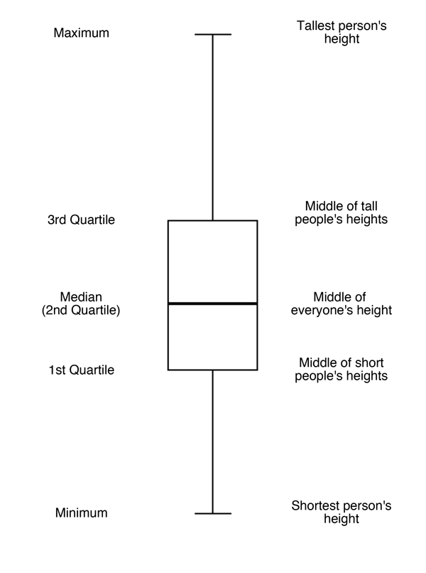
-
Students should now be facing the newly created boxplot. Allow students time to sketch the boxplot in their DS journals, with the appropriate labels.
-
Ask students:
-
What is the difference between the largest and smallest heights? Is there a large difference between the tallest and shortest person? Students should calculate maximum – minimum. Inform students that this difference is known as the range of the data set.
-
What is the difference between the quartiles Q1 and Q3? What percent of our class falls within these two values? Students should calculate Q3 – Q1. 50% of the class falls between these two height values. Inform students that this difference is known as the interquartile range (or IQR).
-
-
Remind students that they learned about one measure of spread (the MAD) during the previous lesson, and tell them that we now have another measure of spread – the IQR. Pose the following questions to the students:
-
What does it mean when the IQR is small? The middle 50% of heights are close to each other.
-
What does it mean when the IQR is large? The middle 50% of heights are more spread out.
-
-
Finally, subset the class into introverts and extroverts. Ask each group of students (the introverts and extroverts) to create a boxplot of their group’s heights on a piece of poster paper using the techniques they just learned as a class.
-
Ask each group to share their boxplot with the class. Lead a discussion about the similarities and differences between the plots, and be sure to include how they compare to the overall combined boxplot of heights they created earlier. In the discussion, have the students calculate the IQR for both plots and make a comparison by asking: What does the IQR tell us about each group? Answers will vary by class.
Class Scribes:
One team of students will give a brief talk to discuss what they think the 3 most important topics of the day were.
Homework
Students should complete the Ages of Oscar Winners handout (LMR_2.7) for homework using their newly acquired knowledge of boxplots