LAB 4E: Some Models Have Curves
Lab 4E - Some models have curves
Directions: Follow along with the slides, completing the questions in blue on your computer, and answering the questions in red in your journal.
Making models do yoga
-
So far, we have only worked with prediction models that fit the line of best fit to the data.
-
What happens if the true relationship between the data is nonlinear?
-
In this lab, we will learn about prediction models that fit best fitting curves to data.
-
Before moving on, load the
moviedata and split it into two sets:– A set named
trainingthat includes 75% of the data.– And a set named
testingthat includes the remaining 25%.– Remember to use
set.seed.
Problems with lines
-
Before learning how to fit curves, let's first fit a linear model for reference.
-
Train a linear model predicting
audience_ratingbased oncritics_ratingfor thetrainingdata. Assign this model tomovie_linear. -
Fill in the blanks below to create a scatterplot with
audience_ratingon the y-axis andcritics_ratingon the x-axis using yourtestingdata.xyplot(____ ~ ____, data = ____) -
Previously, you used
add_lineto plot the line of best fit. An alternative function for plotting the line of best fit isadd_curve, which takes the name of the model as an argument. -
Run the code below to add the line of best fit for the
trainingdata to the plot.add_curve(movie_linear) -
Describe, in words, how the line fits the data. Are there any values for
critics_ratingthat would make obviously poor predictions?– Hint: how does the linear model perform on very low and very high values of
critics_rating? -
Compute the MSE of the linear model for the
testingdata and write it down for later.– Hint: refer to lab 4B.
Adding flexibility
-
You don't need to be a full-fledged Data Scientist to realize that trying to fit a line to curved data is a poor modeling choice.
-
If our data is curved, we should try to model it with a curve.
-
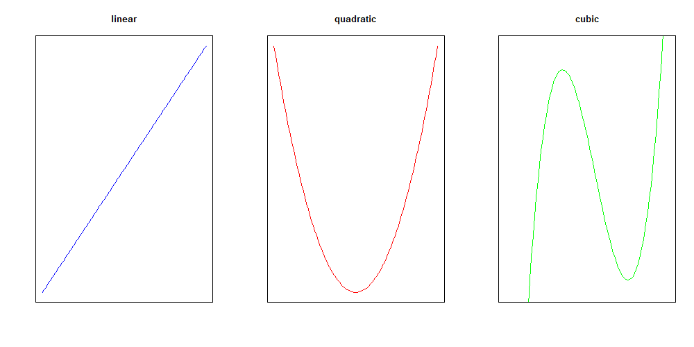
Instead of fitting a line, with equation of the form
- we might consider fitting a quadratic curve, with equation of the form
- or even a cubic curve, with equation of the form
- In general, the more coefficients in the model, the more flexible its predictions can be.
Making bend-y models
-
To fit a quadratic model in
R, we can use thepoly()function.– Fill in the blanks below to train a quadratic model predicting
audience_ratingfromcritics_rating, and assign that model tomovie_quad.movie_quad <- lm(____ ~ poly(____, 2), data = training) -
What is the role of the number 2 in the
poly()function?
Comparing lines and curves
-
Fill in the blanks below to
– create a scatterplot with
audience_ratingon the y-axis andcritics_ratingon the x-axis using yourtestingdata, and– add the line of best fit and best fitting quadratic curve.
– Hint: the
colargument is added to theadd_curvefunctions to help distinguish the two curves.xyplot(____ ~ ____, data = ____) add_curve(____, col = "blue") add_curve(____, col = "red") -
Compare how the line of best fit and the quadratic model fit the data. Which do you think has a lower
testMSE? -
Compute the MSE of the quadratic model for the
testdata and write it down for later. -
Use the difference in each model's
testMSE to describe why one model fits better than the other.
On your own
-
Create a model that predicts
audience_ratingusing a cubic curve (polynomial with degree3), and assign this model tomovie_cubic. -
Create a scatterplot with
audience_ratingon the y-axis andcritics_ratingon the x-axis using yourtestdata. -
Using the names of the three models you have trained, add the line of best fit, best fitting quadratic curve, and best fitting cubic curve for the
training datato the plot. -
Based on the plot, which model do you think is the best at predicting the
testingdata? -
Use the test MSE to verify which model is the best at predicting the
testingdata.